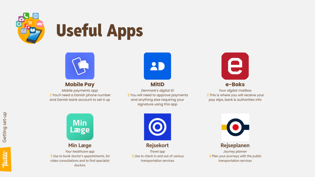
Double Time for Talent – with Eduardo Prado and Said Bahçeci
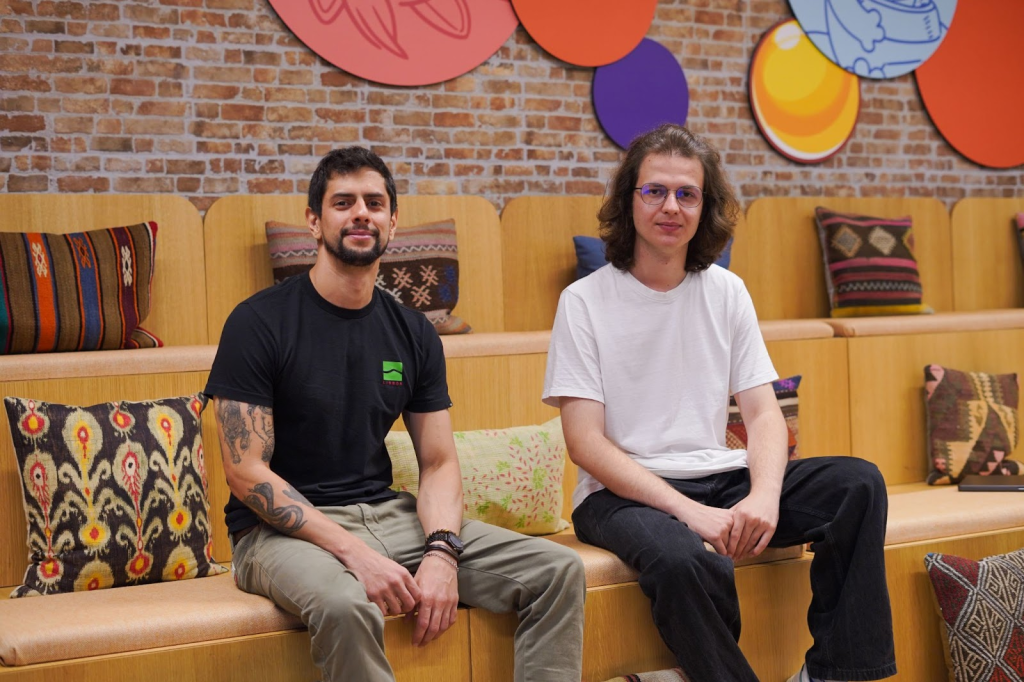
Hi, we’re Eduardo and Said, it’s nice to virtually meet you! 👋
Eduardo: I joined Tactile in October 2024 as a Game Monetization Manager. In my role, my main responsibility is to ensure that Lily’s Garden players are presented with sharp, relevant, and up-to-date content to support their journey through the game. I really enjoy this role because it delivers an interesting mix of technical and creative work.
Said: I joined the team shortly after Eduardo, in December 2024, as a Monetization Manager, and I’m currently working on Lily’s Garden and Simon’s Cat Match. My work mainly revolves around segmentation, contextual offers, balancing, and of course, testing, evaluating, and iterating on these initiatives.
🚀 Before Tactile
Eduardo: I have an extensive marketing background, and before I entered the gaming industry, I was working mostly with marketing and customer relationship management. My first contact with digital products was in the Fintech industry, and from that moment onwards, I knew the path I wanted to pursue. Some years later, I had the opportunity to join Miniclip in a Liveops/Monetization role, where I worked for over 4 years, and I absolutely fell in love with it. Today, I can confidently say that this is what I’ll be doing for the rest of my life.
Said: Back in 2022, while I was still at university, I joined Gram Games as a Product Management intern. I then moved into a Product Manager role for the LiveOps team. Eventually, when the Monetization team was formed, I transitioned there and focused on monetization initiatives full-time.
💜 Joining Tactile
Eduardo: Moving to Copenhagen during winter was a bit challenging, especially for me, coming from a much warmer country. But everyone at Tactile was so careful with the relocation process that things ended up happening super smoothly. Learning everything about a new game, and how everything works in a new company also demands some adaptation period, but all my colleagues were supportive in helping me and integrating me into the product. The routine of working in a big game can be hectic sometimes, but with a little time and patience, all the pieces come together in no time.
Now, almost a year later, I feel fully integrated into the product and responsible for a significant pillar of Lily’s Garden, the main game of the studio. I also made good friends within the company and can say that Copenhagen has a lot to offer as a city. There are endless things to do here.
Said: When I joined, Tactile already felt like a very welcoming place. I noticed early on that people were always ready to help, no matter their title or position, even in one-on-one situations and that’s still true today.
What has changed is that we now evaluate our tests in a more structured way, and our internal tools have grown in both capabilities and use cases. During my time here, I’ve had the chance to see many tests deliver results, and I also got to work on a new game as we launched it globally. Overall, I can say I’m happy with the company I joined and the place I’m in now.
💪 Having an impact
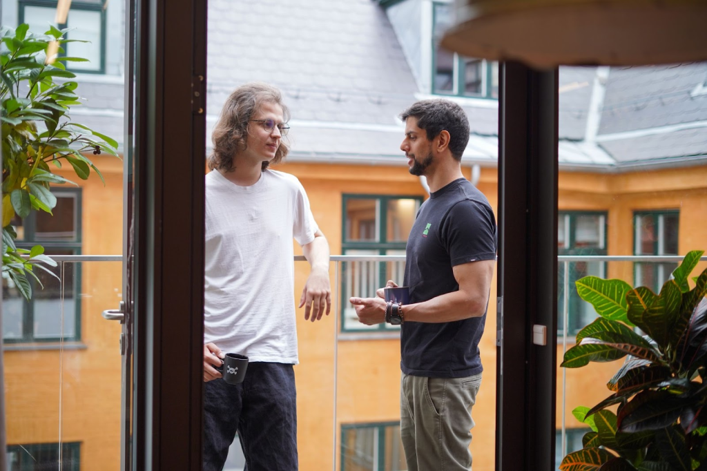
Eduardo: The Liveops & Monetization Team is responsible for designing and delivering meaningful content to players. This content can be in the form of special offers, time-limited events, progressions, collections, and much more. We also define segmentation parameters to ensure that different groups of players receive in-game content tailored to their experience and the way they interact with the game. Nearly everything we release is thoroughly tested, so we can confirm that each addition meets its intended purpose and, most importantly, that players are enjoying it. Tactile has amazing tools built in-house, which allow us to act on things faster and be more agile when planning events, promotions and A/B tests.
Said: As the LiveOps team, our goal is to create a calendar of events and offers shaped around our players’ enjoyment, preferences and needs, and then keep iterating and improving it by introducing new features and updates.
What I find most exciting about LiveOps is being able to see the impact of our work reflected in live data within a short time, and being able to react accordingly. On top of that, Tactile’s flat structure and advanced internal tools give us a fantastic playground to try out ideas and push things forward without unnecessary barriers.
📚 The keys to success
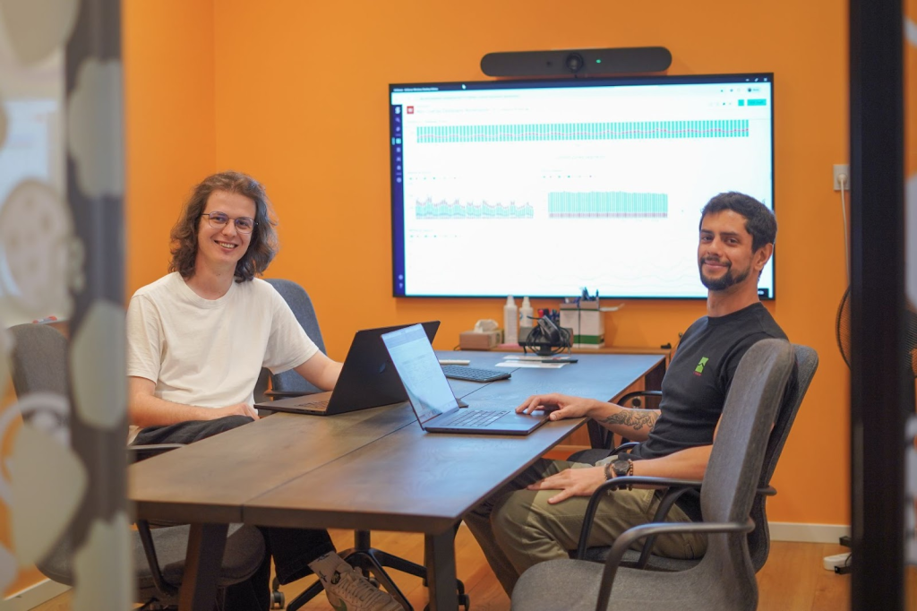
Eduardo: For anyone looking to enter the gaming industry, it’s crucial to understand that games are, above all, products. And as such, it’s important to maintain a critical perspective on everything that happens within them and on how all the pillars of a game connect together.
Don’t be afraid to make mistakes or try new things, stay up to date with others in the industry, play games with a critical mindset, and above all, have fun. Working in gaming can be incredibly rewarding, and that’s what makes it so enjoyable to me.
Said: Play a lot of games, do market research, and have at least a basic understanding of statistics. I think those are great starting points.
I’ve also always believed that curiosity is one of the most valuable traits in this industry. Whether it’s diving into data to find unexpected patterns, exploring new monetization strategies, or just playing a game to understand what makes it fun, I think staying curious is what keeps you learning and improving. And honestly, that’s what makes the job exciting.
Thanks so much for sharing, Eduardo & Said! 💜
What makes game analytics different?
In the world of mobile gaming, analytics play a crucial role in defining new product roadmaps. In contrast to many other industries where data is gathered from ‘flattening’ the world into workable data which can reduce the scope of what is possible to monitor, we have the luxury of being able to track everything within our games. For game analysts, this increases the possibilities for exploration and offers a much more holistic perspective of our products. These are just some of the reasons why Martin and Onur, our Game Data Analysts, believe game analytics is so interesting.
Taking the user perspective into account is a key part of game analysts’ work – we have a wide variety of users both in terms of their skill-set and playing intentions. We have players who enjoy more challenging puzzles and play a huge amount of levels each day, but also inexperienced players who are opening our game for the first time, or even trying out a mobile game for the first time in their lives. All of these different user perspectives push our analysts to take a deep dive into game dynamics and into considering different analytics points. It is important to clarify here that this is of course keeping complete user privacy – our focus is on tracking what our players DO and understanding how they PLAY.
“Having this analytics sandbox allows us to get very creative,” Martin explains, “We can pretty much gather any hypothesis and run with it. In other industries, that’s not always possible. On top of that, we have millions of users, which means that we have access to huge amounts of data. This allows us to get very reactive in our work.”
The ability to gather loads of data and to gather it quickly, allows us to move fast in shifting things like our in-game economy or to get input on new features we’re developing. When the team moves so fast, they can make a real impact on the products. “We are a big part of the company and the decisions that are being made. We want to ensure that we are always working in a very data driven way,” adds Martin.
A holistic view of our products
Within our analytics, we can track step-by step what our users are seeing and doing. We can see how they interact with individual levels, tasks, events, features and offers. Do they click out of different screen views? What things do they accept, which ones do they deny? What is the order in which they receive offers and what impact does this have on their purchasing habits? When they get into the game, what is the first thing they see? What is the last thing they do?
Our analysts therefore work with a wide range of hypotheses. They come up with many of them through their own interaction with the game or project they’re supporting. Onur shares an example: “Recently, whilst playing Lily’s Garden, I set the hypothesis that a different placement of a particular button would make me want to play another level. And so I set up the analysis and designed an A/B test, to see whether my theory holds true in real life. The best thing is that I could see the results very fast – we have a wide user base and so significance is achieved quickly, particularly compared to other clinical trials.”
This ability to track everything in real-time creates variety for our analysts in how they use the data and in the types of tasks they get to do. “As data analysts, we do not sit in a separate room somewhere in the building, filling in spreadsheets. We are on the floors, sitting directly with the teams, whether that’s supporting individual games or marketing teams, and helping them work in a data-driven way,” explains Martin.
Analytics impact on every step of the way
It is our ambition at Tactile to be as data-centric as possible. Our analysts are not just “SQL Monkeys” – they are a key part of every step of the way, from ideation to shipping and even LiveOps, balancing and marketing. Data benefits the entire production pipeline. On top of this, they help ideate on the product side, they have a hand in the design aspect, they help set-up A/B tests, analyse results and help teams drive key takeaways. They’re completely intertwined in all of our projects and so their say really matters. “People will listen to your opinions,” says Onur, “and you can very quickly see the impact of the changes which were applied because of your findings.”
This is especially true when working on a brand new game. Martin started off as a product analyst on our biggest game, Lily’s Garden, which is a great starting point for someone joining the gaming industry for the very first time. However, as Lily’s Garden is an established game, the approach to making changes is different compared to a new game. Lily’s Garden has a large group of long-term players who enjoy the game as it is and it’s important to not change it too much, so as not to let them down in terms of their player experience. In a new game, the product itself and player experiences are still being refined and shaped, which means that players are expecting more changes to come.
The opportunities and challenges of a new game project
After a couple of years on Lily’s Garden, Martin took the opportunity to join one of our newest game projects, Simon’s Cat Match, which was already in production, but not yet fully released.
Having a data person on a new game as early on as possible in its development cycle is really important for two key reasons; one, it helps to set the foundation for analytics on a wider scale and two, it allows the team to keep moving fast and stay data-driven whilst doing so. Martin elaborates: “This means that we’re able to use data to validate big risks and be confident that the changes we are making to the game are positive improvements. We’re a small team, but our ambitions are big and we want to keep growing our game, so it’s crucial for us to stay agile.”
A brand new game is a blank slate and therefore presents a lot more possibilities, but this also comes with more challenges. As the only analyst, Martin has been a big part of the team by supporting and enabling all the changes that are being made in the game. Every new feature, every adjustment and change needs to be tracked and tested properly before it gets released to the entire player base. “This is challenging because of the quantity of the users and also because of the in-game balancing, when we make several changes at the same time,” explains Martin, “Moving fast also means not being able to A/B test everything. This is when methodology and scientific rigor become even more important.”
In his day-to-day, Martin works closely with the game’s Product Manager, as well as other area leads (for game art, animation, level design, programming and QA). As a team, they do a lot of spitballing and brainstorming, so everyone is a big part of making decisions. Martin specifically is involved in everything from designing new features, design tweaking, providing data on existing users, assisting with solving problems, bugs and investigating crashes. He has a real impact on the final look and feel of the game.
Supporting the core of our games
Onur, just like Martin, started on Lily’s Garden product team, but recently moved to working with our Gameboard team. This team is responsible for everything relating to our core gameplay (match-3 puzzles), in particular level design.
Making match-3 puzzle games is our core business and so it’s key for us to ensure that our game levels are both appealing and challenging for all the different user bases we have. “The insights from data are an irreplaceable part of this process,” explains Onur. In his work, he collaborates closely with Product Managers, Level Designers and Gameboard Artists, who are the main drivers of what our users are experiencing in the game.
When it comes to Level Design, Onur needs to support the team with a holistic analysis at all times. “Working with levels has so much depth, it’s almost like working on another game in itself,” adds Onur. What he means by this is that we need a lot of visibility in order to make our levels both challenging and visually appealing – we need data on how our users are progressing through levels, how they are navigating within the levels, which actions they’re taking and how they’re interacting with other parts of the game (such as events). We are also interested in observing different player behaviours, for example whether they are getting disinterested or quitting the game after a certain point. “On top of this, there are things that need to be reworked, design decisions that need to be made and adjusted, and reward structures which need to be established. Analytics needs to stay on top of this at all times,” concludes Onur.
The impact of a strong analytics function
Being so involved in every part of the business, from product development, to core gameplay and even marketing – the impact of our analytics team is huge.
For Martin, the biggest impact in his work comes from driving people towards making decisions based on data, not hunches. “Or at least, to have them use data to confirm or disregard hunches,” he says. “It’s really rewarding being able to reinforce decision making and to see something in the game that you had a direct impact on.” For Onur, this impact is the biggest motivator. He explains: “Trends change so rapidly. A tiny change on the economy side or within another side of the game can create an adverse impact on the trend you’ve been following. This is why it’s so important to detect these things and problem-solve quickly.”
But the impact goes beyond just recommending a change on the feature and seeing it come to life.”Games are so important these days – they’re a huge part of people’s lives and they bring joy to people. It’s truly amazing to be a part of that,” Martin wraps-up perfectly.
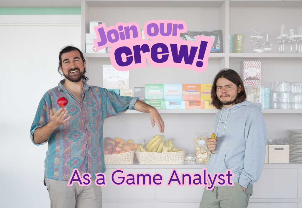
We’re hiring! Come grow with us 🌱 (link is valid until role closes)
Relocating to a new country is a life-changing experience! Whilst there’s a lot of positive emotions around it, the move can also be stressful and overwhelming. How will it be once you get to your destination? Will it be easy to get settled in? Are the public institutions well organized? Is there a good public transportation system in place that is easy to navigate?
At Tactile, we relocate people from all over the world and many of us have been through this experience, asking ourselves the same questions and feeling the same concerns. So to help you get better prepared for your potential move to Denmark, we have put together a comprehensive Relocation Guide.
Depending on where you are in your hiring journey with Tactile, you can refer to one of the 3 sections of the guide, which holds the key information for you to know at this point in time:
- If you’re currently in the interview process with Tactile
- If you’ve signed your employment contract and are about to move to Denmark
- If you have just arrived to Denmark
We hope that this guide helps you to feel more prepared to start your new life in Denmark 🙌

🗣️ If you’re currently in the interview process with Tactile
If you are currently based outside of Denmark and are considering to move here, there is some key information that is good to know very early on.
Already in the initial conversations during the recruitment process, we like to cover the following:
- Your salary expectations
- Your availability
- What is Office Life like at Tactile
- Practicalities surrounding relocation (i.e. would you be moving with a partner, a pet or family?)
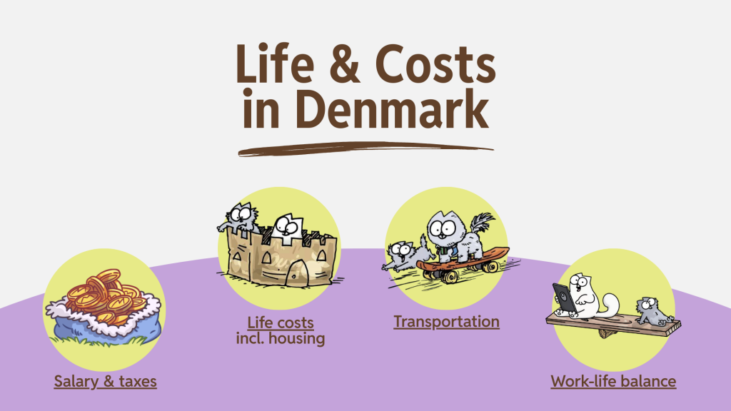
For things like salary, it is important to look at market ranges and general life costs, so that you understand what level of life a certain compensation package can secure you. It is important to put this number into the context of Copenhagen/Denmark.
1️⃣ Section 1 of our Relocation Guide (pages 4-11) will help you to do so! 👌
🤝 If you’ve signed the contract and are about to move to Denmark
Big congrats on your offer! We’re looking forward to welcoming you to our Tactile team very soon! 🥳
Now it’s time to kick-start your relocation process 👏
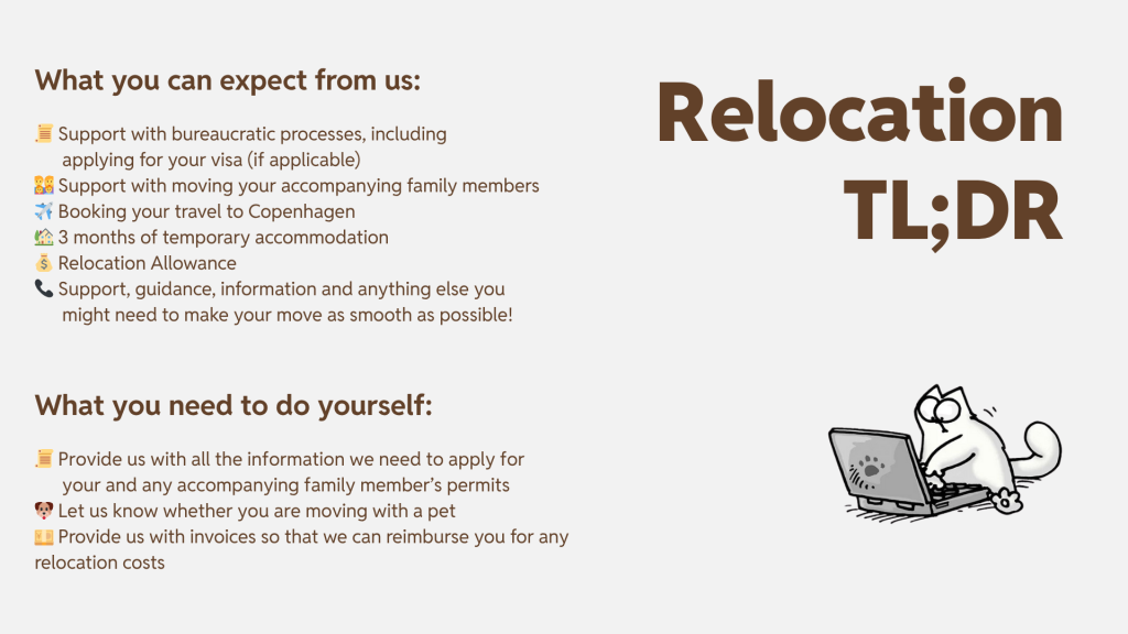
Our People Coordinator will reach out to you via e-mail to get all the details we need to apply for your visa (if required), book your flights and temporary accommodation, and to help relocate any accompanying family members.
2️⃣ Section 2 of our Relocation Guide (pages 12-23) will help to set your expectations regarding the relocation process with Tactile.
💡For a complete overview, please visit Life in Denmark.
✈️ If you have just arrived to Copenhagen
You made it to Denmark! Velkommen ❤️
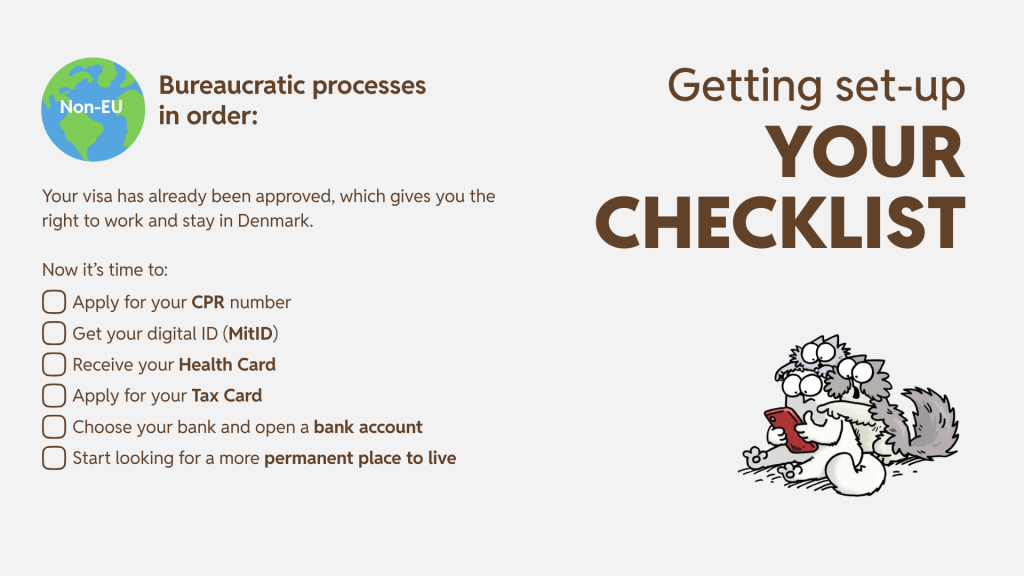
Now we have to get you set up with all the practical stuff. There are a lot of bureaucratical processes in Denmark, but it’s pretty straightforward to sail through them and our People Coordinator will be there to support you throughout the entire journey. Once you receive your civil registration number (CPR) and yellow health card, you’re pretty much good to go 👏 You’ll be able to open a bank account, access your health insurance, receive salary, pay tax, create your digital ID and even borrow books from the library 😄
3️⃣ In Section 3 of the Relocation Guide (pages 24-39), we go over what the standard bureaucratic process looks like, depending on where you come from (Non-EU or EU).
💡For a complete overview please visit the International House.

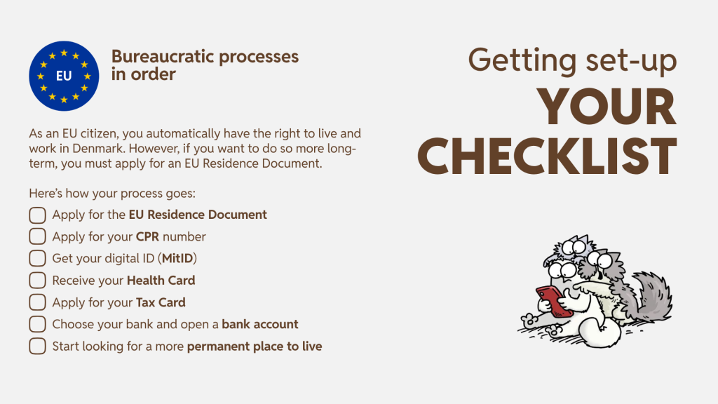
Do not worry – we know this is a looooot of information and it can be overwhelming to take it all in – we are here to support you every step of the way. You will receive all the information again when it’s relevant, so that you don’t have to think about everything all at once.
This Relocation Guide is here to support you wherever in your recruitment journey you might be and it serves as your go-to place to find any information which you might need. We also invite you to check out our Relocation to Denmark FAQs.
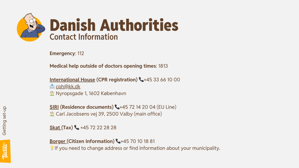
💡In general, Danish authorities provide a lot of useful information online, and we very much recommend that you consult those too. We recommend:
- Ny i Danmark (New to Denmark) – The official portal for foreign nationals who wish to visit, live or work in Denmark
- International House – Your one-stop for registration services, events, and career programmes to welcome you as a newcomer in Copenhagen and many other municipalities
- SIRI – The Danish Agency for International Recruitment and Integration
- Life in Denmark (via Borger.dk) – The official guide to life in Denmark
- Borger.dk (Citizen information) – Your digital gateway to the public sector including information on what to do 🏠 when you move, 🩺 when you need to go to the doctor, 🏖️ when you want to take vacation or apply for other benefits, 👶 when you become a parent, 💰 when you want to invest into your pension, and loads more!
- Skat – Danish tax agency
Good luck with your move! 🍀
