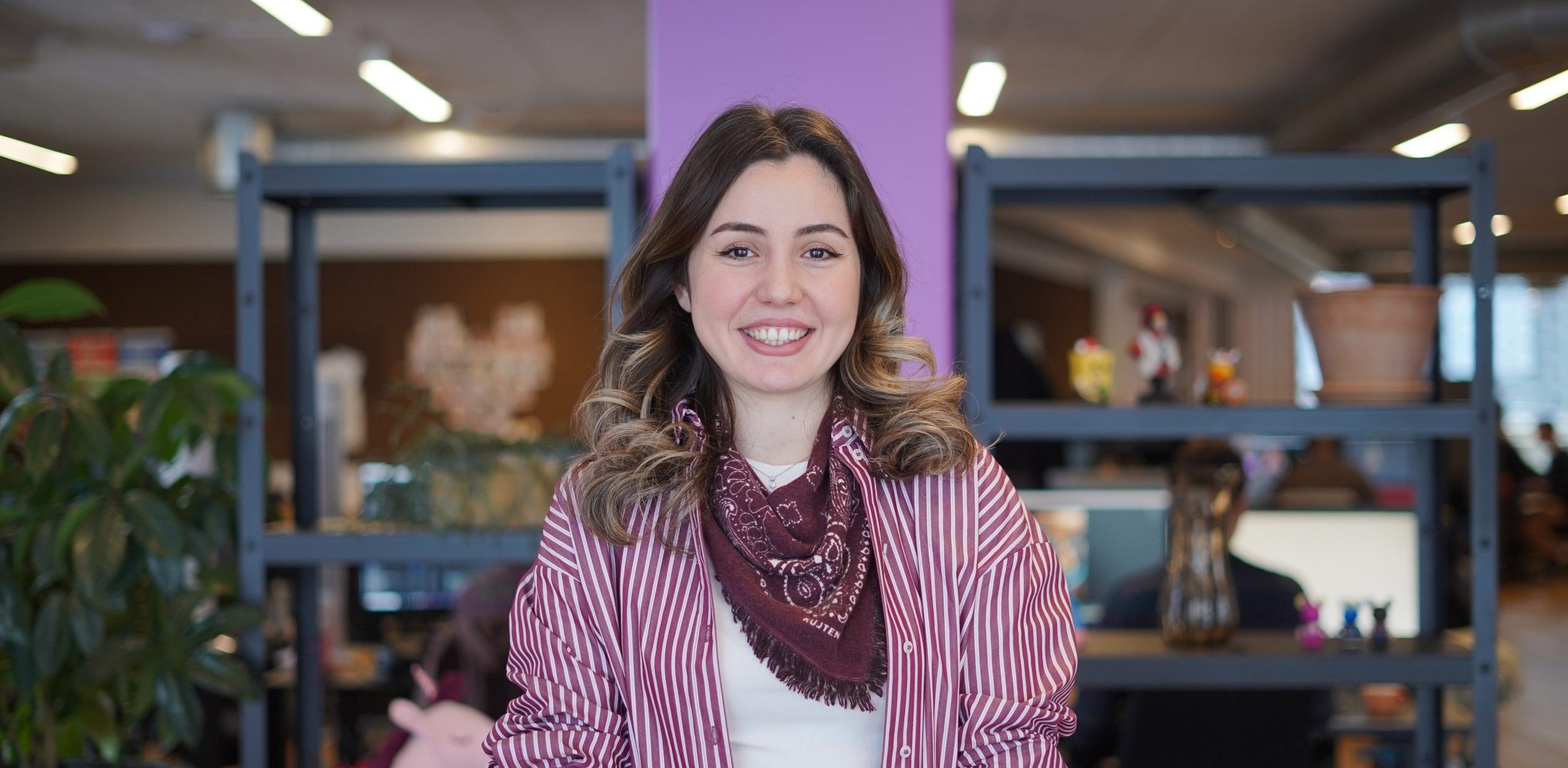
2 years of Joy
An interview with Joydeep Sengupta, our Product Designer
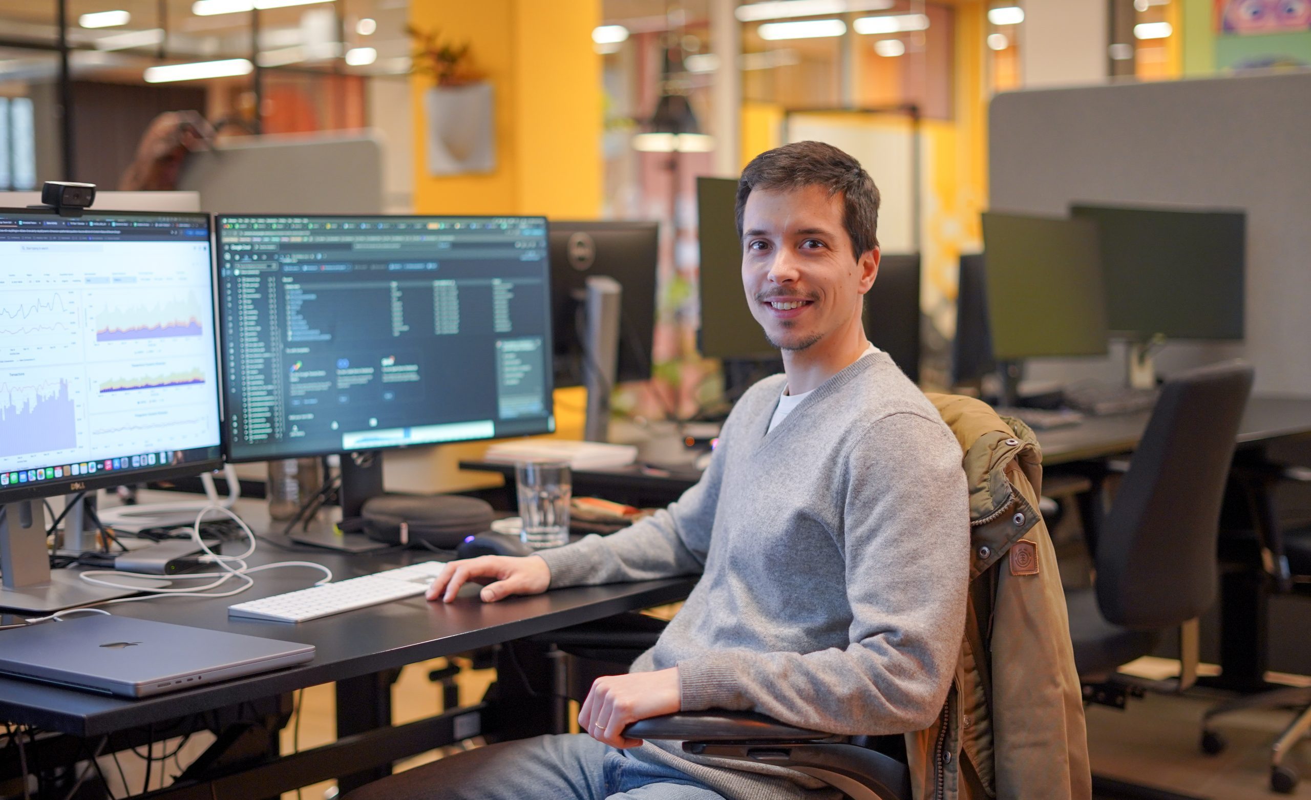
Joydeep Sengupta is our wonderful Product Designer and an integral member of our Core Team. Two years ago, he became the first building block in establishing our new Frontend Team (within the Core Team), focusing on enhancing the UI/UX of our internal tools. These tools were initially built by backend programmers, so you can imagine that they weren’t always very user-friendly or aesthetically pleasing. So, in honour of his 2nd Tactiversary, we wanted to share an insight into his daily work and show how he has been bringing Joy to Tactile for the past 2 years!

The role of the Core Team
The Core Team at Tactile is responsible for building a variety of in-house solutions, which are used to manage our live game (LiveOps), marketing and data operations. These include our business critical LiveOps and analytics dashboards, web services, build server, and loads more! All of these tools have been built in-house from the ground up and are extremely specialised and tailored to what we do. As a Product Designer, Joy along with the engineers on the front-end team, is responsible for anything and everything that requires a UI component.
In this article, we want to particularly focus on our live game operations (LiveOps), how the internal tools we have built help us to manage them, and what impact this has on our players’ experiences. Let’s dive into it!
Tactile: Hi Joy, thank you for taking the time to chat! How do internal tools factor into supporting LiveOps, or treating games as live services?
Joy: To best answer this question, I will first start by explaining what exactly LiveOps, or live game operations are. Think of it as treating a game as a live service, where you can release a bunch of new features, events and engagements without the players actually needing to go to the App Store and updating the entire game. Imagine that a game works as a billboard – every time you would like to put a new advertisement up, you first have to print it and then have people spend time putting it up and replacing the old one. If you instead use a digital billboard, you can easily update the advertisements displayed on it – and that’s basically what LiveOps enables us to do!
There are many aspects of our LiveOps platform, but we primarily use it for launching (new features, events and engagements), testing and measuring (we are completely data-driven as a company and use data to drive our success). And this brings us to why we need specialised internal tools – they enable us to do real-time analytics, targeted player communication and live event management. All of this gives us a unique insight into player behaviour and preferences.
There are not many companies that develop their own internal tools to support LiveOps and there is not a huge amount of companies that provide these services. We realised very early on that if we want to be able to react quickly to market trends and to keep our games relevant long-term, we need very specialised tools – these offer a simple way to keep our games fresh, without needing to change their core. For example, today we’re able to run several mini games with different gameplay mechanics, without having to change our core, match-3 game mechanic. We can also run scheduled events, features, limited time offers and personalised engagements, and we can do so fast!
Tactile: You have been at Tactile for over 2 years now and have worked on many different projects to date. What was the first tool you worked on and what impact did it have on the business as a whole?
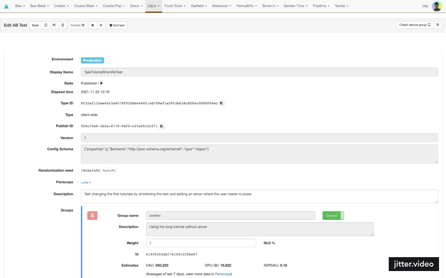
Joy: My first project was working on the A/B test part of the LiveOps dashboard. Initially, the UI was very hard and confusing – it was basically a long list form with many input fields, and it was not clear which fields correlated to or impacted each other.
The way we improved the A/B test workflow was by introducing a card-based UI. Cards are now stacked side by side and all parameters are aligned, so that you can easily compare them and find correlations. A little bit like battle cards 🤣 We also improved the way the tests are created in the dashboard – there was a lot of going back and forth before, but now everything can be done in the same place.
For example, when A/B testing for scheduled features, there are often several test groups (i.e. one that gets 20 coins and the other which gets 40 coins), plus a control group, which doesn’t receive any changes. The UI for all the groups initially looked the same, which sometimes caused mistakes in the back and forth flow we had, in which we had to create a new group, then go back to the editor, create another group, go back again, and so on … Instead, we created a ‘drawer component’ within a tab layout, which shows the dashboard user only the parameters which they are changing (i.e. the amount of coins the player will receive). Besides this, we added a bunch of smaller features, which enable us to have different publishing mechanisms. For example, we can now launch a large number of new feature tests at the same time through the editor, because everything is in one place.
Thanks to these changes, the team now actually realised that their workflow for scheduling features isn’t as efficient as it could be, so they’re working on reworking that.
Tactile: What are some other exciting projects you’ve been a part of?
Joy: One of my favourite projects so far was redesigning the User Support part of the LiveOps dashboard. We spent a lot of time improving it and made some drastic changes!
When a player opens a User Support ticket, there are a couple of fields which are important for the Support Agent to check: (A) Player’s device information – phone model and OS version, (B) Player information – language & country, (C) player status information – level, boosters, and (D) user support metadata – A/B test participation, chat tags. In the original UI, most of this information was at the bottom of the page, so the Support Agent had to do a lot of scrolling and searching for the right information.
We redesigned the UI so that all the most important information is right at the top of the page and then the rest of the page is organised from the most to the least relevant data. Determining the sequence and placement of these sets was crucial due to limited screen space, with only two sets visible without scrolling. Initially, we organised the information in the order of user info (B), device info (A), and play info (C), as preferred by the user support team when receiving messages. However, testing revealed that the team also occasionally wanted to view metadata. Consequently, we adjusted the order again. Furthermore, we refined the arrangement of sub-categories within each set to enhance the visibility of relevant information.
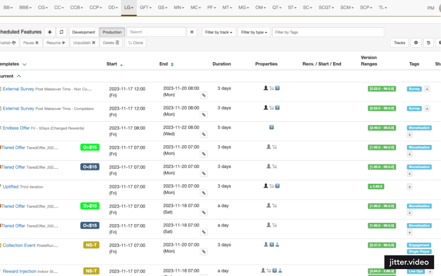
Currently, I am working on the Special Offers part of the LiveOps dashboard, and I think this is one of the best projects I’ve worked on so far at Tactile! We are releasing a bunch of different special offers in our games (i.e. the Halloween & Christmas themed offers). The way the system is set up right now, our Producers and Product Managers need to go to the dashboard and configure the offer settings manually (i.e. the number of coins and/or boosters the player receives when they purchase the offer). Before they actually go to the dashboard, they plan the offers in an Excel sheet. So as you can see, there is a lot of manual data entry work. What my team and I are working on at the moment is designing and building a system, which will enable our teams to do all the planning in an Excel sheet, then port it to the system, and after that LiveOps will automatically configure and launch the offers for them. This means that they will no longer need to interact with the dashboard as much as they do now, which will make the process faster and more efficient for them!
Tactile: What is your work process when redesigning or coming up with a new UI?
Joy: The process always starts with talking to the user. We have very small, but extremely impactful groups of users and 90% of the solution is based on what they need. After that, I start checking other, similar products on the market to get some inspiration. For example, for the Special Offers project, I am looking into different CRM tools, which have a system that enables their users to port Excel sheets of customer data onto the platform.
Once I get some inspiration, I start making flow diagrams in Figma. When I am designing them, I am thinking of every possible decision the user might need to make when using the tool: What if they would like to create something new? Or delete something? Or add something to it? While this is a crucial step to kick-off the creation process, I don’t spend a lot of time wireframing, because we want to keep things moving fast.
What I like about the design process here compared to the other places I worked at, is that the developers get involved very early on in the process – the feedback loop is fast and short. It’s what we like to call ‘the tech check’. I speak with our Core Team Lead and Lead Frontend Engineer about our programming capabilities. Is the design realistic in terms of programming resources? Is there a library we can use to save development time? We want to be able to ship these very specialised, very complex tools quickly. This ties in very closely with our lean production mindset at Tactile – we try to avoid waste by overproducing and overprocessing. So instead of the developers getting involved only at the end, once the design is finalised (which could take several months), they are continuously giving their input from the very start of the process.
Tactile: People don’t find internal tools as appealing software, and are usually not interested in designing projects for internal use. Why did you sign up for this “boring job”?
Joy: I signed up because the tools we’re working on are extremely complex and specialised, and that makes our work really challenging and interesting! After 2 years at Tactile, I am still trying to wrap my head around how everything works and how it’s all linked together.
For example, if you have to make a company website or an ecommerce web application, there’s already been a thousand similar things done which you can use for inspiration. But if you have to build a LiveOps tool, something like Scheduled Features … Well, just try googling that and you will pretty much get zero results. This is because all of these tools are highly specialised for their own use case (in our case it’s for the production of casual mobile games with a story component) and that’s the beauty of internal tools – it’s hard to get inspired from similar projects, so you have to be very creative and come up with everything from scratch! And in order to be able to do that, you really need to have excellent business understanding. Even from one gaming company to another, the games are built completely differently.
Another thing that I love about internal tools is that there is no business pressure in terms of the look and the feel of the product, like there might be in more traditional product companies. Based on the data from the market, the business has to do what the customers want, but that might not necessarily be what you would like to do as a designer! Since we’re building tools for our internal teams, rather than our players, we have a lot of freedom in pursuing different design options, as long as the teams are finding the tools easy and intuitive to use. For me, when you have a lot of freedom to explore design options, without having to stick to a particular business angle, it’s the purest form of creativity you can have as a UX Designer.